

November 18, 2026
•
20
min read

Lovable Design System: How to Keep a Consistent UI as Your App Grows
How Lovable's design systems feature works, when to use it over themes or knowledge files, and how to stop UI drift. Talk to a Lovable developer to set it up.
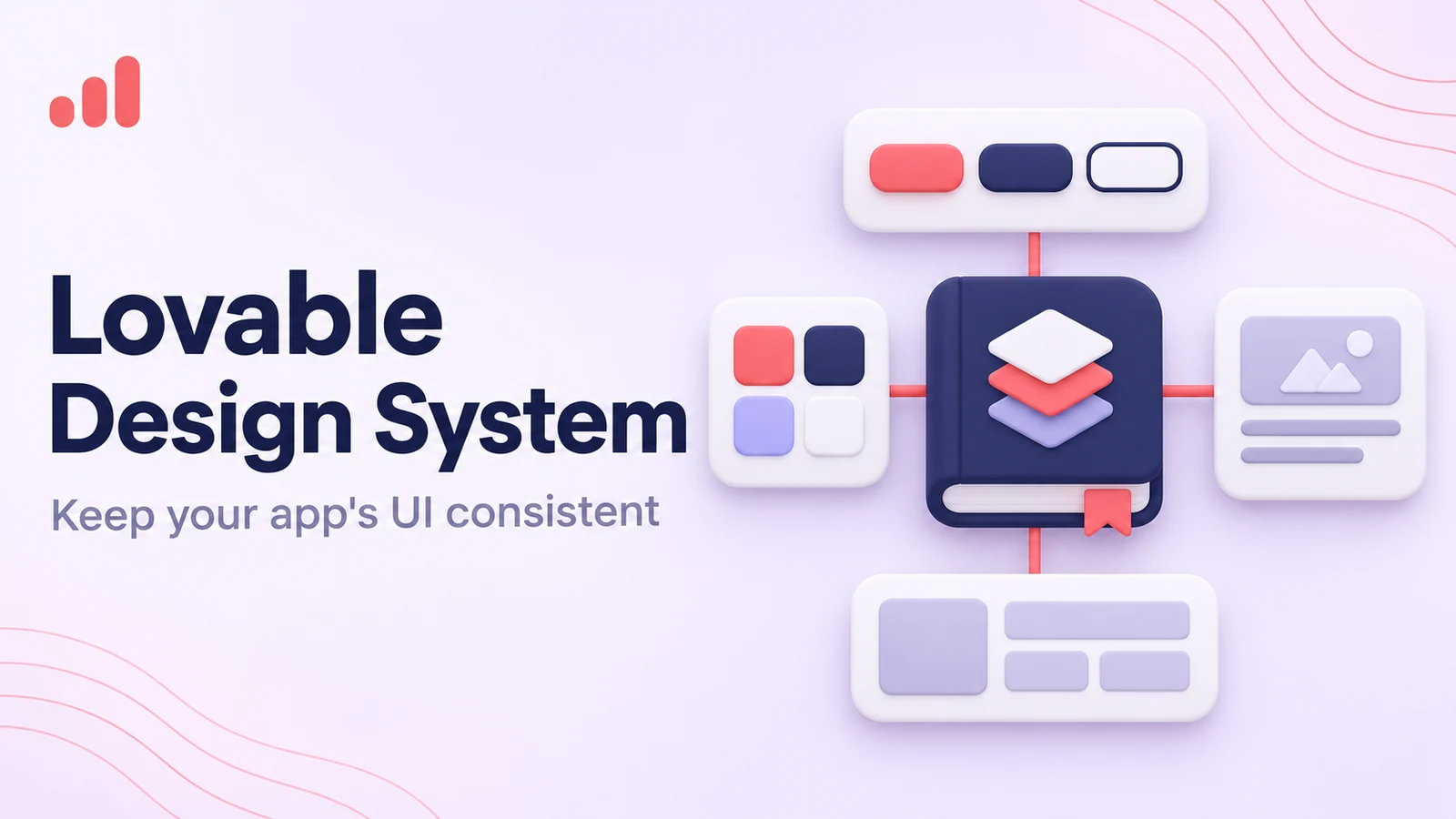
A Lovable design system keeps buttons, typography, spacing, colors, and reusable components consistent as your app grows. Instead of relying on prompts to recreate the same styles, you give Lovable a shared component library and clear design rules. Experienced Lovable developers can also help bring an existing app's scattered styles into one maintainable system.
In its January 2025 post Reinventing Design Systems, Lovable outlined a more code-focused approach to keeping interfaces consistent as products evolve.
Its dedicated design systems feature gives teams a central place to manage shared components, styling rules, and setup requirements.
What is a Lovable design system?
A Lovable design system is a separate project that holds reusable React components, design tokens, styling guidelines, and setup instructions for other Lovable apps.
Instead of asking Lovable to recreate a button or form from a written description, you can give it an approved component library.
That library becomes the reference for how your product should look and behave.
According to Lovable's design systems documentation, a design system contains three main parts:
- Components: Reusable React elements such as buttons, inputs, dialogs, navigation, and cards.
- Schema and guidelines: Design tokens, component definitions, usage rules, and technical constraints.
- Installation instructions: The configuration and dependencies needed to use the library in connected projects.
Lovable keeps this information in a dedicated design system project.
When another project connects to it, Lovable brings in the relevant components and rules and records which version is installed.
That makes it easier to use the same approved UI elements across applications without recreating them every time.
Why does this matter for a growing product?
Imagine a SaaS company with a customer dashboard, an internal admin interface, and a partner portal.
All three use the same brand colors, typography, buttons, and form patterns.
Without a shared library, each app may gradually develop its own version of those elements.
A design system gives the team one place to maintain them.
If the primary button needs a new hover state, the change can be made in the design system project and released for connected apps to adopt.
That doesn't mean every screen has to look identical.
Different apps can have different layouts and workflows while still sharing the same visual language and core components.
Why does a Lovable app's UI drift as it grows?
Lovable apps can develop inconsistent interfaces when new prompts introduce styles or components that don't quite match what's already there.
The changes are usually small at first.
An early prototype may have only a handful of screens, so differences are easy to spot and fix.
As the app expands, there are more components, layouts, and styling decisions to manage.
Different prompts may produce slightly different solutions to the same design problem.
Common signs of UI drift
Watch for:
- Primary buttons with different heights, padding, or corner radii.
- Inconsistent spacing between headings, fields, and cards.
- Several shades of what should be the same brand color.
- Duplicate components doing the same job.
- Different form validation and error-message styles.
- New screens that don't match the original layout conventions.
- Previously corrected styles changing after regeneration.
Teams often notice the problem when they encounter style bugs after regeneration.
A prompt meant to update one part of the interface may introduce new styling choices somewhere else.
Why aren't prompts enough?
You can tell Lovable to use consistent buttons throughout an app.
That may work perfectly well for a small project.
But "use consistent buttons" doesn't define padding, variants, disabled states, focus styles, loading behavior, or accessibility requirements.
A component library can define those details once.
The team no longer has to describe them from scratch every time it adds a screen.
When does UI drift become a real problem?
Inconsistency becomes expensive when the team keeps fixing the same issues.
Developers spend time correcting generated components. Designers review familiar styling problems. New features take longer because different UI patterns have to be reconciled.
The problem grows when several people work on the product or multiple apps share the same brand.
That's usually when informal design instructions need more structure.
Theme, knowledge file, visual edits, or design system: which do you need?
Use a theme for broad visual styling, project knowledge for written instructions, visual edits for individual adjustments, and a design system when you need shared components and consistent rules across projects.
These tools overlap, but they aren't interchangeable.
| Option | What it controls | Best for | Plan needed | Main limitation |
|---|---|---|---|---|
| Theme settings | Colors, typography, and general visual styling | Small apps and straightforward brand adjustments | Depends on the styling feature used | Doesn't provide a complete reusable component library |
| Project knowledge | Written instructions, brand rules, and development conventions | Guiding generation within one project | Depends on current project and plan features | Instructions can still be interpreted inconsistently |
| Visual edits | Specific elements, text, spacing, and styling | Quick refinements and targeted corrections | Depends on current feature availability | Local edits don't create shared standards across projects |
| Design system | React components, tokens, usage rules, dependencies, and versioned releases | Growing products and teams maintaining multiple apps | All paid plans; wrapping an npm package needs Enterprise | Requires setup, maintenance, and an update process |
Plan details reflect Lovable's documentation as of November 2026.
When is a theme enough?
A theme is often all you need when the goal is to apply consistent colors, fonts, and basic styling.
A small internal tool, for example, may need to look on-brand without requiring a separate component library.
In that case, it's more practical to customize themes and UI styles than to build a full design system.
Themes work well for broad visual decisions.
They don't necessarily define how a complex table, multi-step form, or navigation component should behave.
When should you use project knowledge?
Project knowledge helps Lovable understand the app's requirements and conventions.
You might include:
- Brand colors and typography.
- Preferred layout patterns.
- Naming conventions.
- Accessibility expectations.
- Rules for using existing components.
- Technical requirements.
These instructions can help you get consistent output from Lovable, especially within a single project.
But knowledge files are still instructions.
They don't provide the same consistency as a maintained React component library.
When are visual edits useful?
Visual edits are useful when a specific element needs attention.
You may want to change a heading size, improve spacing, or adjust the appearance of a form.
In Introducing Visual Edits, Lovable describes how users can make these changes directly instead of relying on prompts for every adjustment.
It's convenient for local refinements.
But if the same change is needed across several projects, updating a shared component is easier to maintain.
When do you need a full design system?
A design system becomes useful when consistency needs to hold up through ongoing development.
That might mean a growing SaaS product, several apps sharing one brand, multiple contributors working on the UI, or a prototype moving into long-term maintenance.
The deciding factor isn't a particular number of screens.
It's whether the team keeps solving the same design problems over and over.
How do you create a design system in Lovable?
You create a Lovable design system by starting a dedicated project, adding or building a React component library, defining its rules, and publishing an initial release.
The interface may change as Lovable updates the feature, but the documented workflow follows these steps.
Gather your design rules and tokens
Start with the decisions that should stay consistent across the product.
Document brand colors, typography, spacing, corner radii, shadows, and other recurring styles.
If the app already exists, review its current screens before defining the system.
Look for patterns that work well and should be preserved.
You don't need to keep every variation. Decide which styles should become the standard.
Suggested screenshot: A design reference showing brand colors, typography, spacing values, and button styles.
List your core components
Identify the components your app uses most often.
A typical starting set includes:
- Buttons and button variants.
- Text inputs and form controls.
- Select menus and checkboxes.
- Cards and containers.
- Dialogs and modals.
- Alerts and notifications.
- Navigation elements.
- Tables and pagination.
- Loading and empty states.
Include the states that matter: hover, focus, disabled, loading, error, and success.
A button isn't fully defined by how it looks before someone clicks it.
It also needs to behave consistently when people interact with it.
Suggested screenshot: A component inventory showing buttons, form controls, cards, and their main variants.
Create the design system project
In Lovable's documented workflow, open the menu from the prompt box, select Design, choose Use a design system, and then select Create design system.
Lovable creates a dedicated project for the library.
Give it a clear name, particularly if your workspace contains several apps.
You can bring in an existing React component library or build one through instructions inside Lovable.
The documentation describes options involving npm packages, public repositories, and uploaded source files.
Private packages must be scoped and need a workspace build secret, and wrapping an existing npm package requires an Enterprise plan.
Suggested screenshot: Lovable's design system creation menu and the new project.
Configure and release the system
Once the components and styling rules are ready, publish the first release.
Lovable generates a machine-readable schema and supporting rule files.
The important files include:
- design-system.json: tokens, component definitions, variants, and technical constraints.
- rules/components.md: component reference information.
- rules/design-tokens.md: token definitions.
- rules/library-guidelines.md: library and stack requirements.
- system.md: higher-level setup instructions and design guidance.
These files help Lovable understand which components to use and how they should be configured.
The system.md file holds guidance that should remain in place across releases.
Suggested screenshot: The release interface showing the published version and generated rules.
Connect the design system to your apps
After publishing the first release, connect the system to the projects that should use it.
Lovable copies the shared components and rules into each connected app.
The project records which version it's using.
For a new app, this provides a consistent starting point.
For an existing one, you'll still need to review components created before the design system was introduced.
Suggested screenshot: Project settings showing the connected design system and its version.
Set up an update process
Decide who can modify the design system and how changes should be reviewed.
A straightforward process might look like this:
- Propose a component or token change.
- Review its effect on existing screens.
- Update the design system project.
- Publish a new version.
- Test it in a connected app.
- Roll it out to other projects.
Avoid making changes to shared components directly inside connected apps.
Those edits won't become part of the central design system.
Suggested screenshot: A connected Lovable project showing an available design system update.
What should a Lovable design system include?
A useful Lovable design system should include design tokens, reusable components, usage guidelines, accessibility requirements, and the configuration needed to use the library consistently.
You don't need every possible UI element from day one.
Start with the components and rules your team uses most often.
Design tokens
Tokens are named values for recurring design decisions.
Instead of assigning a color directly to every button, the app can reference a token such as a primary background color.
Common token categories include:
Colors: Brand, text, background, border, success, warning, and error colors.
Typography: Font families, sizes, weights, and line heights.
Spacing: Consistent values for margins, padding, and gaps.
Borders and radii: Border widths, corner radii, and outlines.
Effects: Shadows, elevation, and other recurring visual treatments.
Responsive rules: Breakpoints and layout conventions where needed.
Tokens make changes easier to manage.
If the brand's primary color changes, the team can update the relevant token instead of searching through individual components.
Typography and fonts
Typography consistency involves more than choosing a font family.
Headings, body text, labels, helper text, and error messages all need clear rules.
If the product uses a brand font, make sure it's installed and referenced consistently.
Teams should add custom fonts carefully to avoid conflicting declarations or unexpected fallbacks.
Typography also needs to work across different screen sizes.
Reusable components
Components should cover the patterns users encounter repeatedly.
A button library, for example, might define primary, secondary, destructive, and text variants.
Each variant should have consistent sizing, spacing, interaction states, and accessibility behavior.
The same applies to form fields, cards, dialogs, and navigation.
A good component library reduces the temptation to create another slightly different version of something that already exists.
Usage guidelines
The library should explain when and how components are used.
For example, destructive actions might always use a particular button variant. Error messages might always appear below the relevant form field.
These rules help maintain consistency beyond colors and spacing.
They also make it easier for new contributors to understand the product's UI conventions.
Accessibility
Include accessibility requirements from the beginning.
Buttons need visible focus states. Form fields need appropriate labels. Text and backgrounds need sufficient contrast. Interactive components should support keyboard navigation where applicable.
A shared design system makes accessibility improvements easier to apply across a product.
It doesn't guarantee accessibility automatically, though. Components and the screens using them still need testing.
How do you connect and update Lovable projects?
Lovable connects apps to a released design system by copying its components and rules into each project and recording the installed version.
When a new version is released, connected projects can accept the update.
What happens when you connect a project?
Lovable places the shared React components in a directory similar to:
src/design-system/<design-system-slug>/
The supporting rules are copied into the project's .lovable directory.
Required dependencies are also added to the project configuration.
This makes the shared components available as local React code while preserving their connection to the original design system.
How do updates work?
When the design system project publishes a new version, connected apps show an Update available prompt in the project chat.
Accepting the update replaces the managed design system files with the new version.
Lovable also runs setup checks to verify that the library is connected correctly.
The app's own code isn't automatically rewritten to match every new component or pattern.
That's why testing still matters.
What should you never edit directly?
Don't make permanent changes inside src/design-system/ in a connected app.
Those files are managed by the design system.
Local changes can be overwritten when the project accepts a later update.
If a shared button needs a new variant, make the change in the design system project and publish a new version.
That keeps the component consistent across connected apps.
Can workspace admins set a default?
Yes. Workspace admins and owners can set a released design system as the default, which is pre-selected when members create new projects; on Business and Enterprise plans, each group can have its own default.
This helps teams establish a consistent starting point for new projects.
A default doesn't replace design reviews, though.
The team still needs to maintain the library and check the resulting UI.
How do you add a design system to an existing Lovable app?
You can add a design system to an existing app by connecting a released library, reviewing the current components, and gradually replacing duplicated or inconsistent elements with approved versions.
Treat it as a migration, not a one-click fix.
Start with a UI audit
Review the existing app for:
- Duplicate button components.
- Inconsistent typography.
- Repeated color values.
- Different spacing patterns.
- One-off cards and form fields.
- Components with conflicting behavior.
- Styles that are difficult to maintain.
You don't need to document every tiny difference.
Focus on patterns that appear repeatedly or cause maintenance problems.
Decide what to keep
An existing app may already contain components worth preserving.
A well-designed data table or navigation component, for example, could become part of the shared library.
Other components may be redundant or inconsistent with the intended design.
This is also a good time to review how design files relate to production code.
If the product's components were originally designed in Figma, the Figma to Lovable import is a separate step from the design system: it turns designs into screens, while the system needs those components as reusable React code.
Connect the released design system
Once the shared library is ready, connect it through the project's design system settings.
Lovable attaches the library and its rules.
Then review which existing elements should be replaced or updated.
The goal is to move toward shared components without unnecessarily rebuilding working screens.
Migrate one section at a time
For a larger app, start with a contained area.
You might standardize login and account settings first, then move to dashboards and administrative screens.
Replace duplicate components with approved versions and check the results at different screen sizes.
Pay attention to behavior as well as appearance.
A replacement form control may look right but behave differently during validation or keyboard navigation.
Test before rolling out changes
After connecting or updating a design system, review critical user flows.
Check navigation, forms, dialogs, tables, responsive layouts, and custom interactions.
If several apps share the system, test a new release in one lower-risk project before applying it everywhere.
The migration is complete when the app consistently uses the intended components and the team has a clear process for future updates.
What are the limits of Lovable design systems?
Lovable design systems make UI consistency easier to manage, but they don't eliminate testing, component maintenance, or technical oversight.
There are also platform limitations worth understanding before you start.
React libraries are the foundation
Lovable's design systems are built around React component libraries.
They aren't a general-purpose solution for sharing components across unrelated frontend frameworks.
Lovable's docs state that Vue, Angular and Svelte are not supported today.
One design system per project
A Lovable project can connect to one design system at a time.
If an app needs components from several libraries, the team may need to consolidate them into one compatible system.
That matters for organizations managing multiple brands or independently maintained component libraries.
Package integration may need additional setup
An existing React library may be distributed through npm, a repository, or source files.
Private packages need appropriate access configuration.
Wrapping an existing npm package requires an Enterprise plan, and the package must ship typed exports or the release fails.
Review those requirements before assuming an existing library can be connected without changes.
Updates can create compatibility problems
A new design system release may change component behavior, dependencies, or styling assumptions.
Even when the managed files update correctly, an app may depend on older component properties.
Versioned releases let teams control when updates are applied, but they don't remove the need for regression testing.
Styling frameworks can conflict
Some projects run into styling problems when the design system's requirements don't match the app's existing configuration.
Different Tailwind CSS versions or missing stylesheet imports, for example, can cause components to render incorrectly.
Lovable performs setup verification, but teams may still need to investigate issues such as Tailwind classes not applying.
A design system doesn't replace product design
A shared library can keep buttons, forms, and typography consistent.
It can't decide whether a workflow is intuitive, whether information is organized well, or whether a screen solves the user's problem.
Those decisions still require product thinking, design judgment, and testing.
A design system gives the team consistency. It doesn't make every design decision for them.
When should you get help with a Lovable design system?
Professional help makes sense when an app has accumulated inconsistent components, several projects need to share one UI library, or the team is preparing to maintain a product beyond its initial prototype.
A small app with a handful of screens may only need better theme settings and project instructions.
A larger product often needs more.
The team may have to review existing React components, define design tokens, consolidate duplicated code, establish update rules, and test compatibility across apps.
That work benefits from frontend development experience and familiarity with Lovable.
Signs you may need outside help
Consider bringing in experienced developers when:
- New screens repeatedly introduce inconsistent styling.
- Several apps need to share the same components.
- The team has multiple versions of buttons, forms, or navigation.
- An existing React library needs to be connected to Lovable.
- Design system updates cause build or styling problems.
- The app is moving from prototype to a product maintained by several contributors.
The point isn't to add complexity.
It's to give the team enough structure to keep developing without revisiting the same UI problems.
How can RapidDev help?
RapidDev, a Lovable Select Partner agency, helps teams develop, refine, and maintain Lovable applications.
As a Lovable Select Partner, RapidDev works with companies that need more than an initial AI-generated prototype.
For design system projects, that can include:
UI audits. Reviewing existing screens, components, and styling patterns to identify inconsistencies.
Design token setup. Establishing reusable colors, typography, spacing, and other styling values.
Component libraries. Consolidating duplicated elements and defining reusable React components.
Design system configuration. Preparing the library, rules, and project setup for Lovable.
Existing app migration. Connecting a shared system and replacing inconsistent elements without unnecessarily rebuilding the app.
Update workflows. Establishing release, testing, and maintenance practices for shared components.
Frontend troubleshooting. Resolving styling conflicts, dependency issues, and component compatibility problems.
Some teams need a shared library across several applications. Others only need to clean up an existing UI.
The right scope depends on how the product is built and how the team plans to maintain it. A design system also makes it easier to hand the app to a development team later, because the shared components and rules are already documented.
FAQs
Does Lovable support design systems?
Yes. Lovable supports dedicated design system projects containing reusable React components, styling rules, design tokens, and installation instructions.
Connected apps can use the shared library and receive versioned updates.
The feature helps teams maintain consistent interfaces as their products grow.
Which Lovable plans include design systems?
Design systems are available on all paid Lovable plans. Wrapping an existing npm package as a design system requires an Enterprise plan.
Themes, project knowledge, and visual edits are separate capabilities.
Can I import my Figma design system into Lovable?
You can use Figma designs as a reference when building a Lovable design system, but a Figma file isn't the same as a reusable React component library.
Lovable's design systems feature works with React components, styling rules, and setup instructions.
If your design system exists only in Figma, its components and tokens may need to be translated into a compatible code library.
Can one Lovable project use more than one design system?
No. Lovable currently supports one connected design system per project.
If you need components from multiple libraries, you may have to combine them into a single compatible system or change which design system the project uses.
Will updating the design system break my app?
An update can introduce compatibility or styling problems, particularly if components, dependencies, or configuration requirements change.
Lovable provides versioned releases and setup verification, but updates should still be tested before being applied to production apps.
Review important screens and user flows after significant changes.
If your app already has dozens of screens, our Lovable developers can extract a design system from what you already have instead of rebuilding the UI.