

About
The Buttons UI Pack is a lightweight template that provides a variety of ready-made button styles, ideal for any FlutterFlow project. Whether for CTAs or navigation, this kit saves time and maintains consistent design throughout your app.
Features

Questions? Can’t find the right template? Contact us!
We’re happy to answer any questions or assist you in finding the perfect template for your project. Response times are typically within 12 hours.


Explore more templates
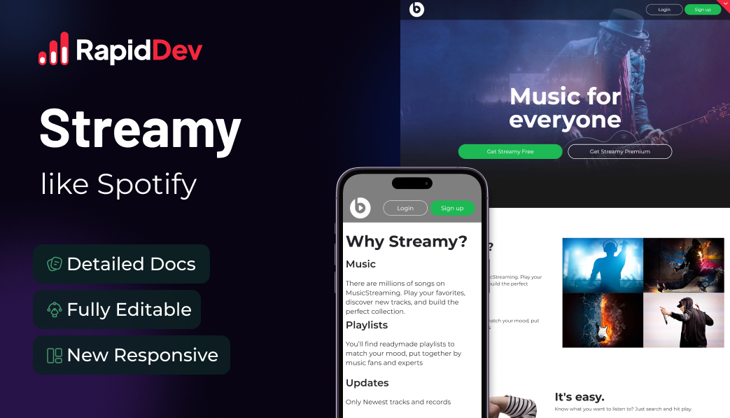
A responsive no-code Bubble template designed for creating music streaming apps similar to Spotify.
Streamy is a responsive no-code Bubble template designed for creating music streaming apps similar to Spotify. Upload albums and tracks, and curate your own music playlist with your favorite genres. If you're in the music industry, this Bubble template offers an excellent way to showcase artists to niche or private audiences.
Music Streaming Template, No-Code Music App, Spotify-Like Music Streaming, Responsive Music App, Album Creation and Upload, Music Selection by Genres, Music Playback Feature, Following and Unfollowing Albums, Subscription Plans (Free & Premium), Powered by Stripe, Admin Panel for Music App, New Bubble Responsive Engine, Streamy Music Streaming Template, No-Code Music Streaming App, Spotify Alternative Music App, Responsive Music Streaming, Create and Upload Albums, Music Selection with Genres, Playback Music Tracks, Follow and Unfollow Albums, Free and Premium Subscription Plans, Stripe-Powered Music App, Admin Dashboard for Music Streaming, Updated Bubble Responsive Engine Template, Music, Streaming, Spotify, Responsive, Album, Genres, Playback, Subscription, Admin, Stripe, Apple Music, Soundcloud, Pandora, Deezeryoutube, clone, authentication, spotify, streaming, online, soundcloud, tracks, genres, musicians, audio, playlist, streamy, music, radio, netflix, sound, soundcloud, artists, entertainment, html, all templates
January 19, 2026
1509533547629x219195209475424260


(
78
installs)
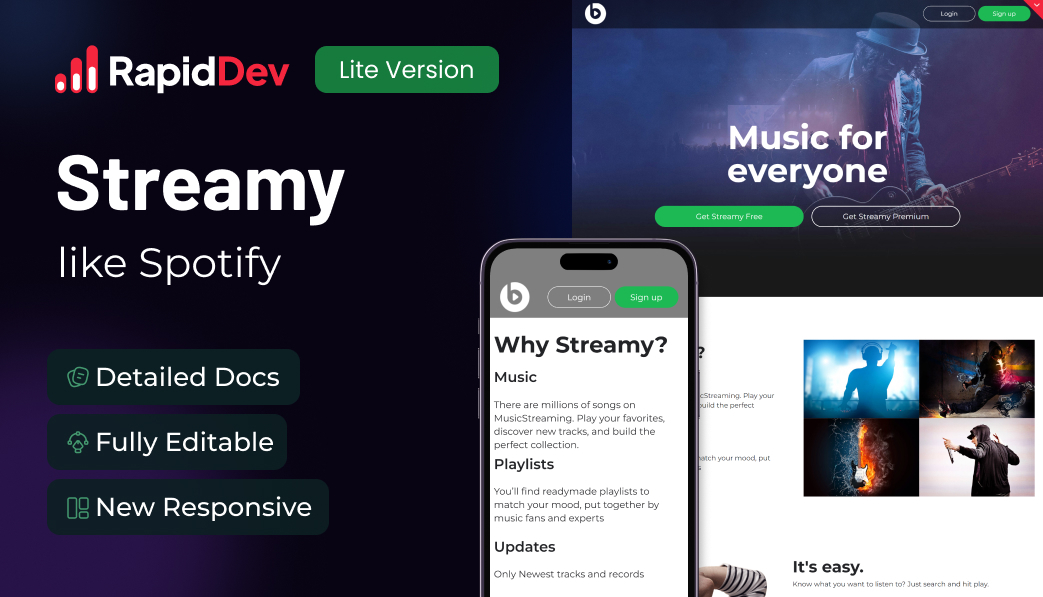
Streamy Lite is a responsive no-code template for creating music streaming apps similar to apps like Spotify.
Streamy Lite is a responsive no-code template for creating music streaming apps similar to Spotify. Upload albums and tracks, and curate your own music selection with your favorite genres. If you're in the music industry, this Bubble template offers a great way to showcase artists to niche or private audiences.
Music Streaming Template, No-Code Music App, Spotify-Like Music Streaming, Responsive Music App, Album Creation and Upload, Music Selection by Genres, Music Playback Feature, Following and Unfollowing Albums, Subscription Plans (Free & Premium), Powered by Stripe, Admin Panel for Music App, New Bubble Responsive Engine, Streamy Music Streaming Template, No-Code Music Streaming App, Spotify Alternative Music App, Responsive Music Streaming, Create and Upload Albums, Music Selection with Genres, Playback Music Tracks, Follow and Unfollow Albums, Free and Premium Subscription Plans, Stripe-Powered Music App, Admin Dashboard for Music Streaming, Updated Bubble Responsive Engine Template, Music, Streaming, Spotify, Responsive, Album, Genres, Playback, Subscription, Admin, Stripe, Apple Music, Soundcloud, Pandora, Deezermusic, musicians, tracks, playlist, subscription, plans, payments, stripe, soundcloud, spotify, audio, sound, artists, netflix, genres, authentication, login, signup, radio, all templates
January 19, 2026
1648707297727x342941933499842560
(
143
installs)

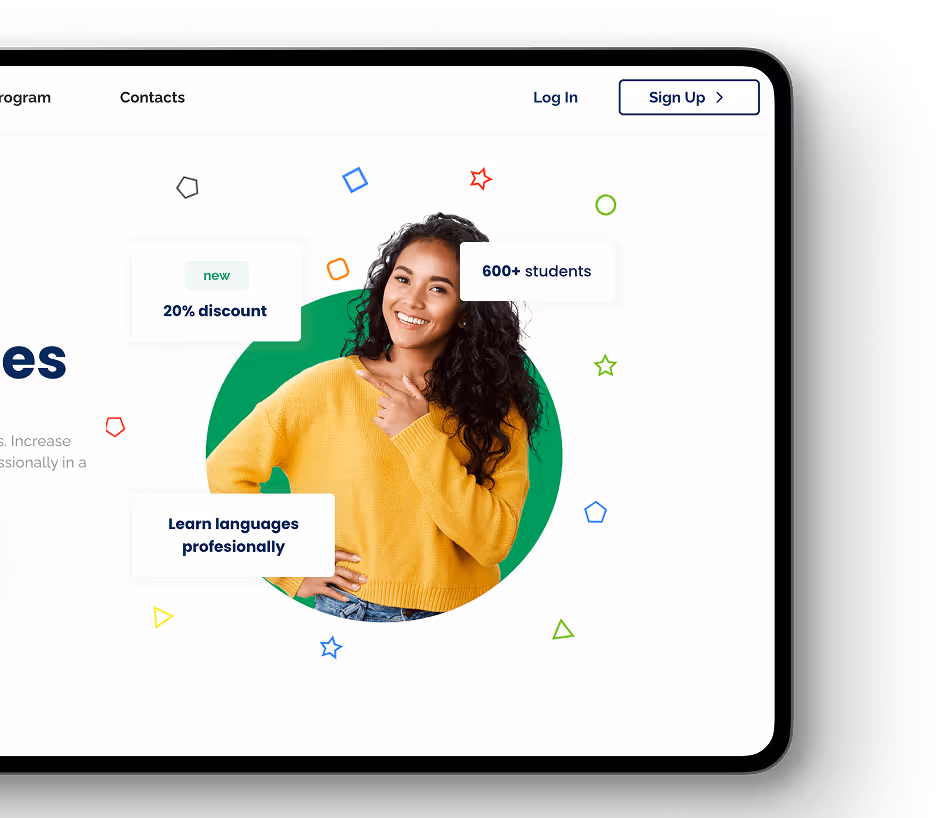
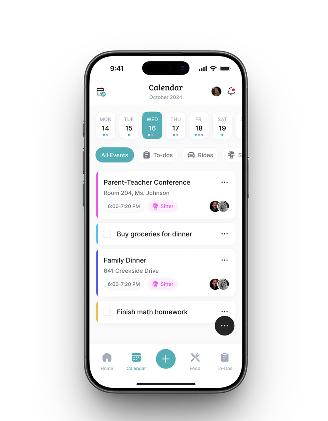
AcmeCal 📆
$
199
A clean and effective calendar FlutterFlow template for appointments, meetings, and personal scheduling.
AcmeCal is a lightweight and versatile calendar app FlutterFlow UI template built for professionals, businesses, and personal productivity. Whether you're scheduling meetings, managing daily tasks, or planning appointments, AcmeCal helps streamline everything with a responsive layout and intuitive flow. Ideal for developers looking to integrate calendar logic into their apps quickly.
December 20, 2025
(
5
installs)
Thank you for choosing RapidDev!
Join our email list for access exclusive deals and important updates.
Oops! Something went wrong while submitting the form.


